Kollect
Kollect
UX Research & Design: simple user onboarding and content management
UX Research and Design - Neil Ranada
Project type - Concept for content management desktop application
Time - 3 months
Location - San Diego, CA
Summary
People like to collect notes, images, and links. And there are some great finds that people can't wait to share with family and friends.

Source: Pinterest
But sometimes you struggle to remember where you saved things. Did you scribble it on a post-it? Jot it in your notebook? Save it in your phone? Save it in your laptop?! You may end up feeling like Batman.
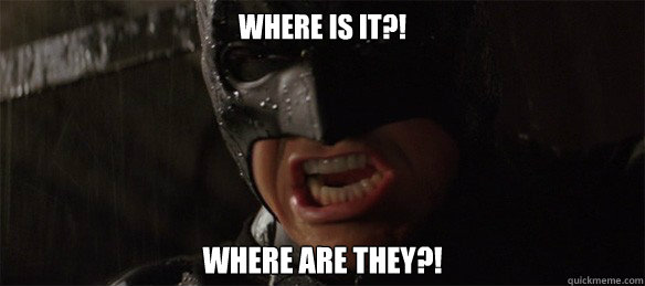
Source: Quickmeme
Kollect is a web application design that lets you easily manage your notes, images, and links all in one place.
Problem
People have a difficult time remembering where they saved notes, images, and links.
Solution
A web application where people can save content all in one place and access it anywhere.
Research
I started my research with a survey posted online to various social media platforms and public forums. I needed to get a feel for what problems may exist if any. I asked questions focused on people’s past behaviors for saving and organizing items.
Here are my key findings from 31 responses:
- Over half said that when they find an interesting image or link online, they save it
- When asked how they save content: 51.5% use a browser bookmark while 42.4% download it
- The top three tools for bookmarking were: browser (70.6%), Pinterest (35.5%), and Facebook (32.4%)
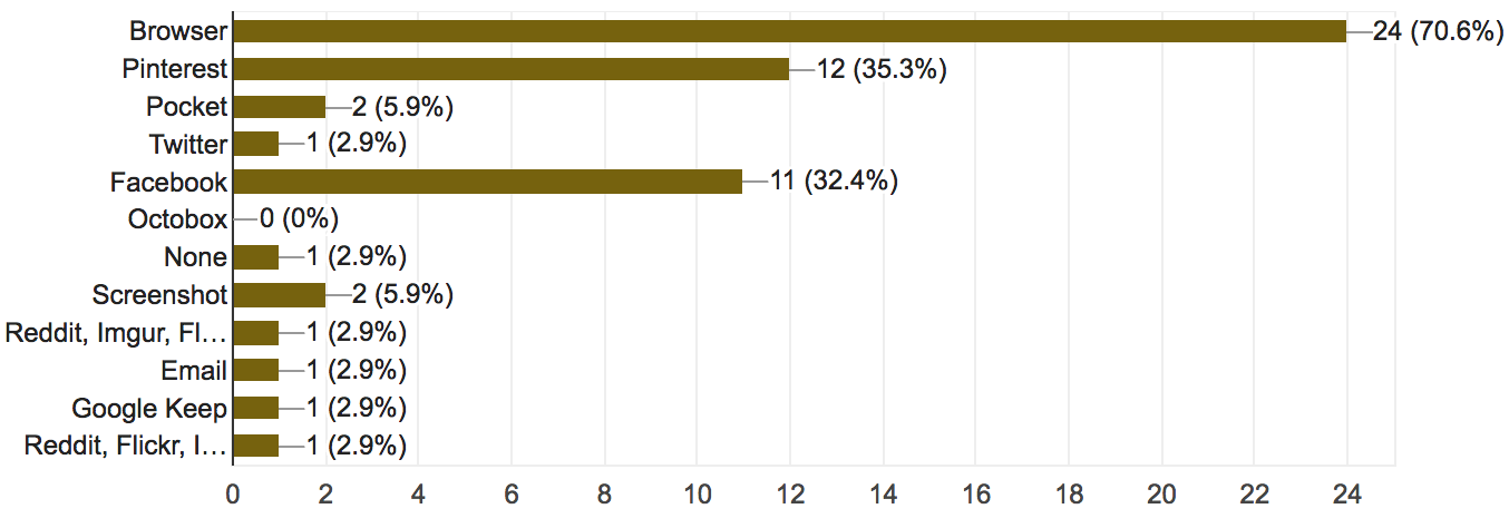
Specific tools or sites used for bookmarking
When asked what they liked MOST about tools for saving items, some said:
- “Saving it in the browser is quick and easy. Saving it in Google Keep allows me to be more organized than just bookmarking in the browser.”
- “Streamlined design, everything needed is on your screen, functions without fault.”
- “Screenshots I save in a photo album on my smartphone, bookmarks will take you directly to what you want to pull up at another time.”
When asked what they liked LEAST about tools for saving items, some said:
- “Sometimes I can’t find what I saved.”
- “Browsers just show title and no preview for what is on the site. It would save time from having to open different links if you could preview it in when you mouse over the link.”
- “I bookmark too many things, and they are hard to organize, or I forget about them.”
When asked about their note taking behaviors:
- At varying levels, more than half said they take notes.
Notetaking behavior
When asked what applications they used to write and keep notes:
- 75.8% used smartphones
- There are many note-taking tools available on the market, but none relatively stand out: Other (33.3%), Evernote (15.2%), Microsoft Word (18.2%), Desktop applications (15.2%), and None (9.1%)
What some said they liked MOST about note taking tools they used:
- “Syncs to my cloud.”
- “I like the notes option on my iPhone the best because it’s easy to access, save and delete.”
- "Google Keep – can add as many notes as needed, can check things off your list, can color code, can access from home or phone, easy to stay organized."
What some said the like LEAST about note taking tools they used:
- “Some require Internet connection.”
- “Sometimes I forget my planner.”
- “Too much trouble to search for particular notes.”
Other findings:
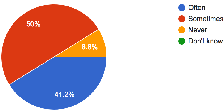
- 76.2% said they work in a collaborative environment
- Over half said they share resources (files, images, links, etc.) with their co-workers
- 76.9% used Facebook or Twitter to sign up for an account on other websites because "it's quick and easy."
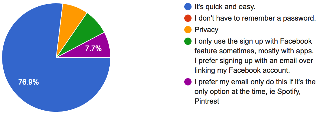
Why people use social accounts for signing up for other websites
What I learned from survey results
Most people don't have a problem saving things with whatever tool they are using.
However, despite the ease of saving items, people complained that their files eventually become disorganized and difficult to find and sort later.
Finding an opportunity to solve a problem
I needed to dig deeper and move beyond a feeler survey. I began with an assumption: people need a website that allows them to easily save, share, and collaborate with content from any device.
To validate this assumption, I needed to answer three questions:
- Do people need a single point for saving, sharing, and collaborating on content?
- Who is experiencing frustration?
- What do they need to improve their content management experience?
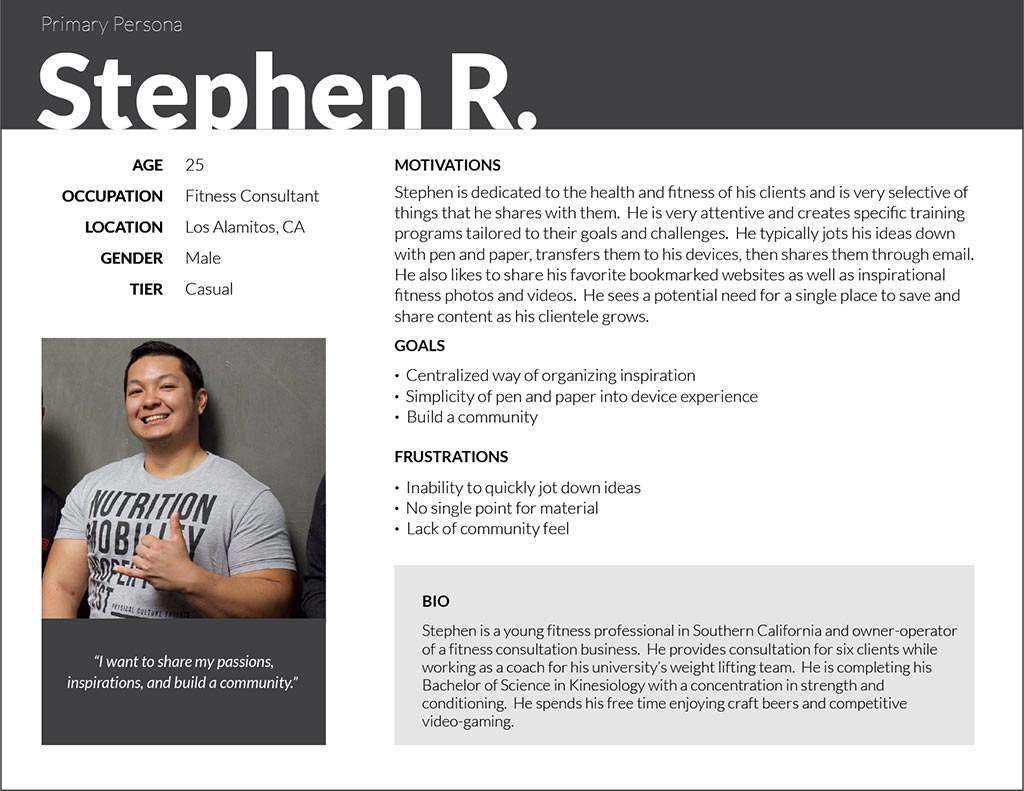
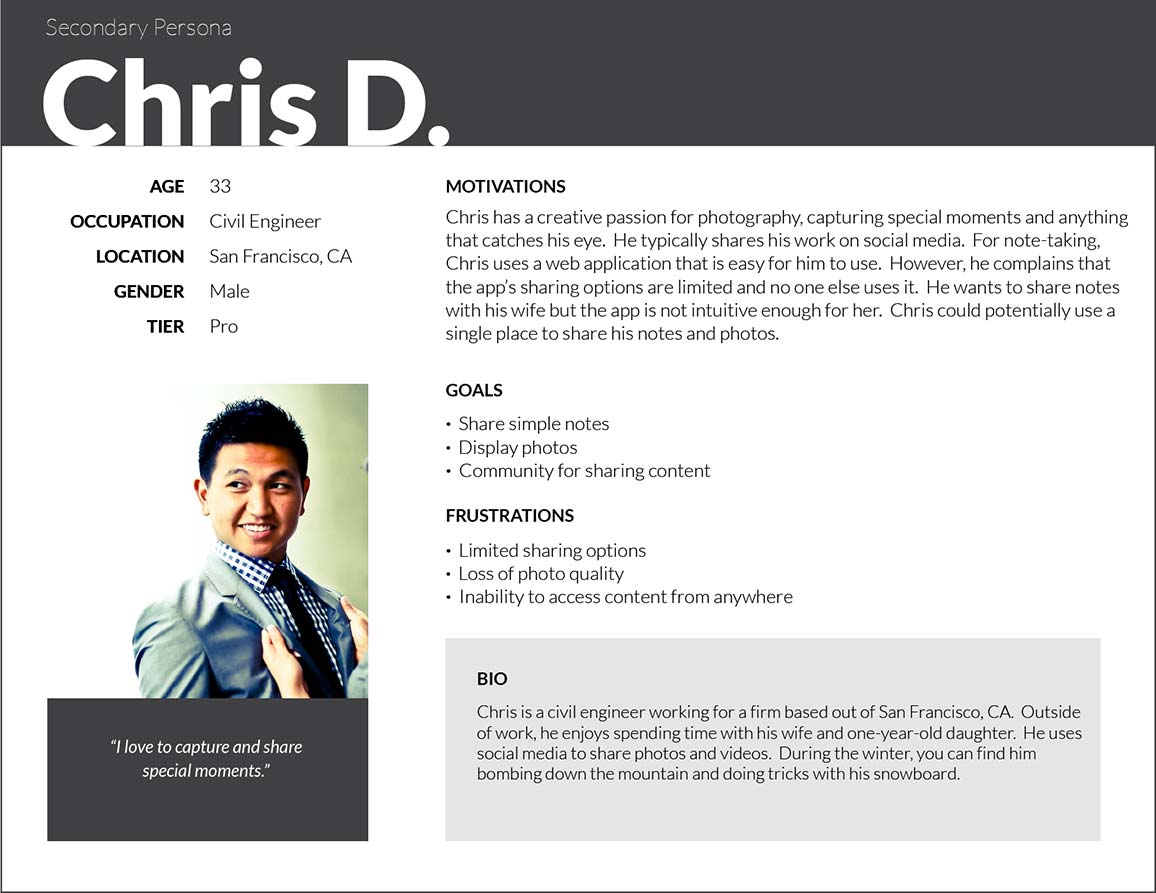
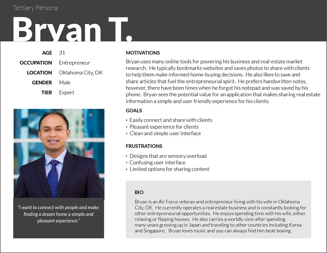
User Personas
I identified three people to interview and used them as models to create the User Personas. I focused on learning about their past experiences with saving and organizing things that interest them most.
Open PDF file for User Personas in another tabopen_in_new
Stephen is the primary persona and the focus for the design. Out of the three personas, meeting his goals and addressing his frustrations would also address the needs for the secondary and tertiary personas.
The User Personas have different interests for managing content: fitness, photography, and business.
However, they share three common goals:
- One place for saving and organizing things they can access anywhere.
- Quickly save simple notes, images, and links.
- Easily share things with other people.
I used these three goals as the focus for my design decisions.
Competitive Analysis
I needed to learn from the design patterns of more popular web applications. I identified three: Evernote, Google Keep, and Ember.
I created matrixes such as the one below to assess the strengths, weaknesses, opportunities, and threats of each web application (SWOT analysis).
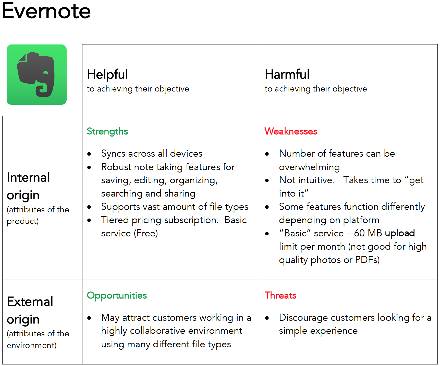
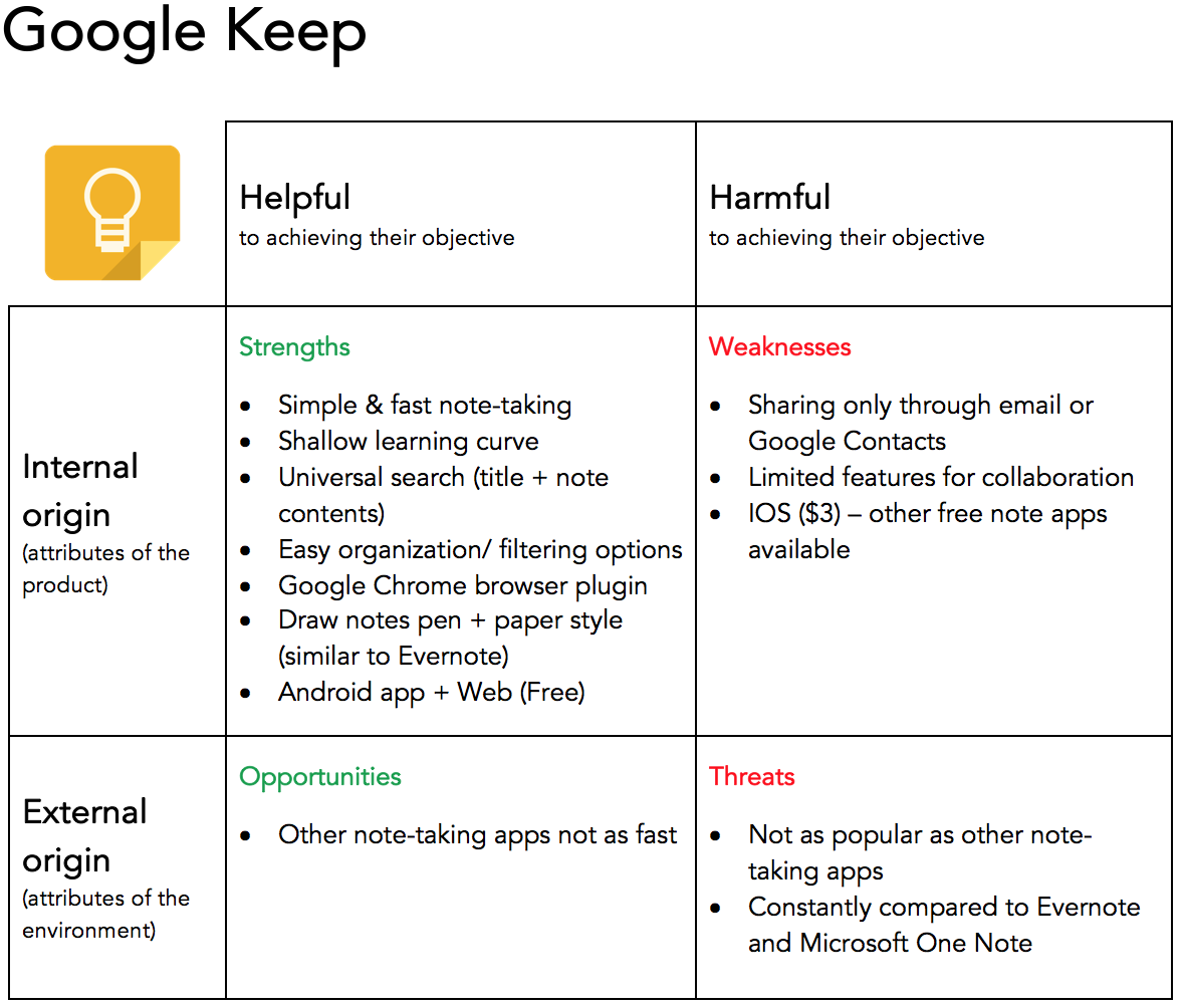
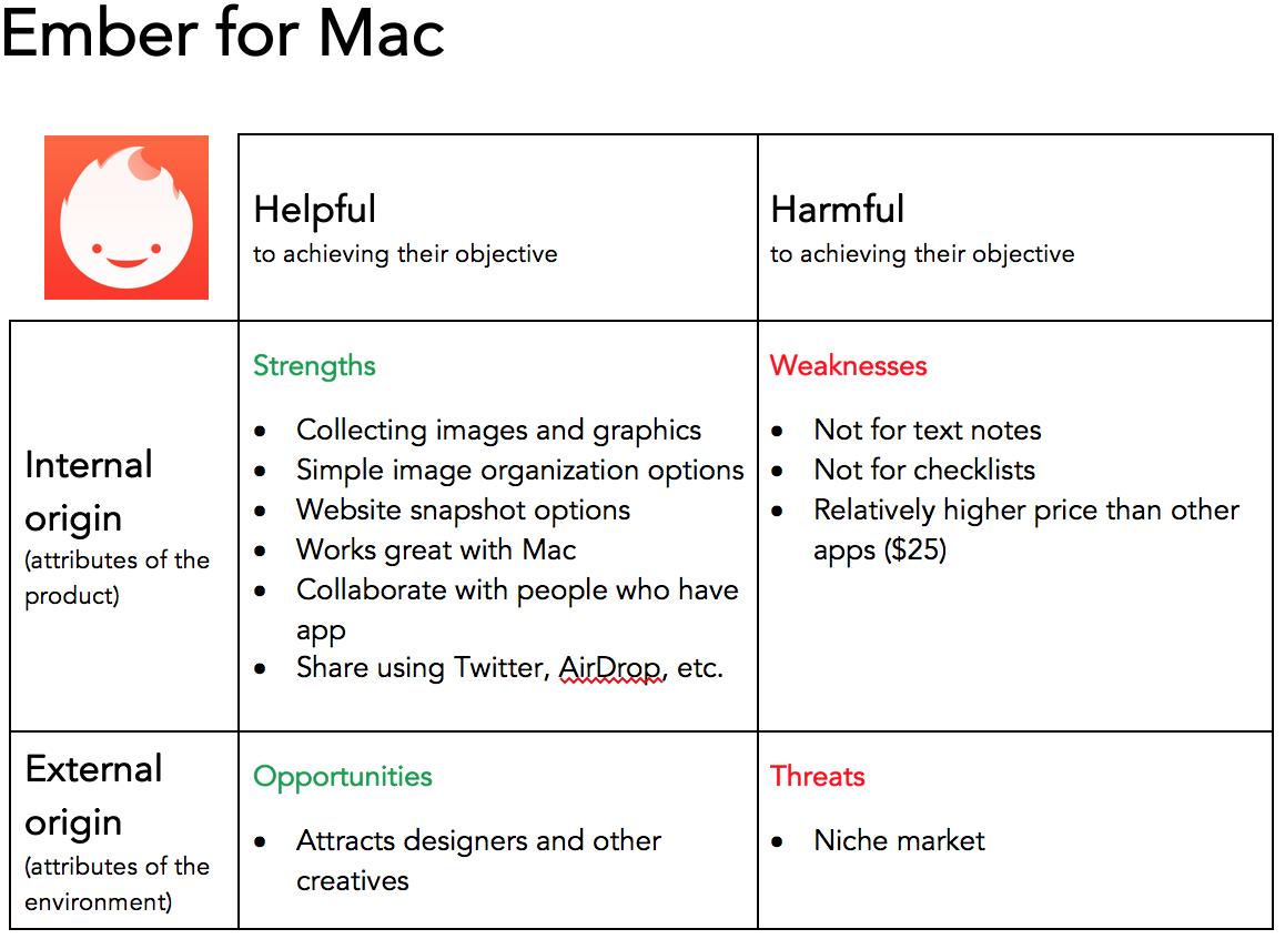
View analysis matrixes for other apps in another tabopen_in_new
Top three strengths to include in the design:
- Allow people to quickly add content such as notes, images, and links.
- Provide a shallow learning curve.
- Content synced across devices so they can be accessed anywhere.
Top three weaknesses to avoid in the design:
- Having too many features that overwhelm people.
- Being too restrictive on how people share items.
- Not intuitive to use.
Meeting research goals
- Do people need a single point for saving, sharing, and collaborating on content?
Yes. - Who is experiencing frustration?
People who want to add and organize content like the three user personas. - What do they need to improve their customer checkout experience?
A single place where they can easily add, organize, and share notes, images, and links. They also must be able to access it from any device.
Design
After conducting user research and defining the problem, I was ready to move forward and create design solutions.
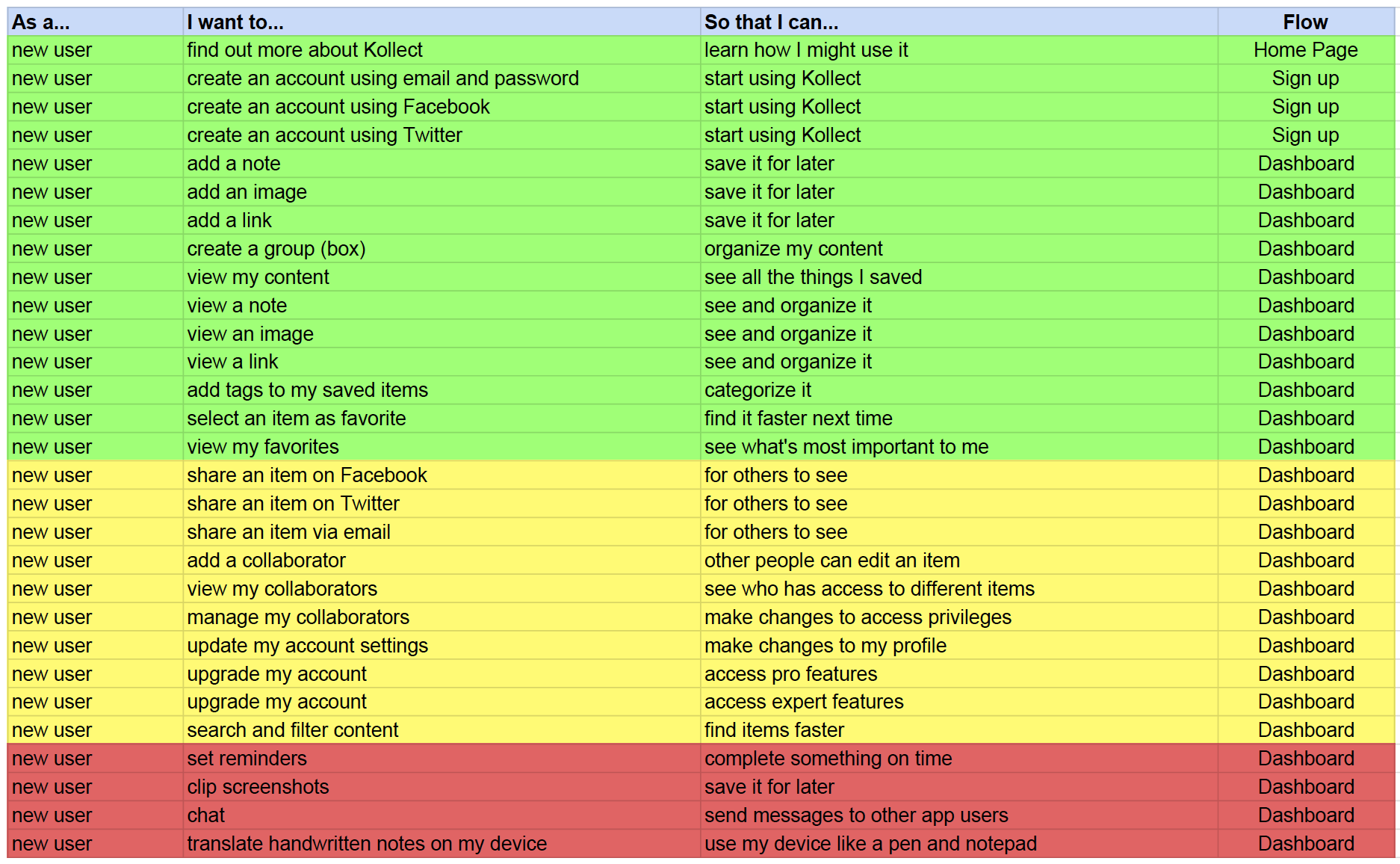
User Stories
I created a spreadsheet with a list of tasks to meet the goals of the user personas.
"As a __________, I want to __________ so that I can __________."
New User:
Returning User:
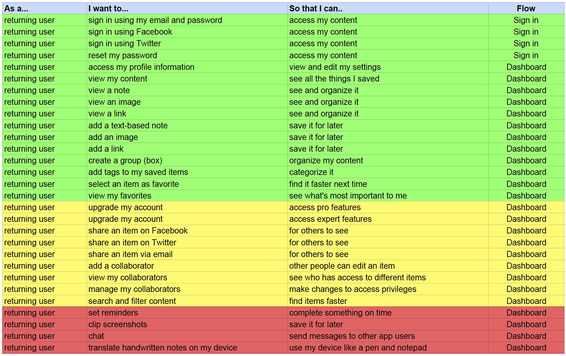
Open Google Sheets for User Stories in another tabopen_in_new
User Flows
I created User Flows to visually depict how people completed each task set out in the User Stories.
Onboarding Flow
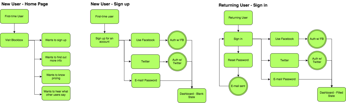
Dashboard Flow
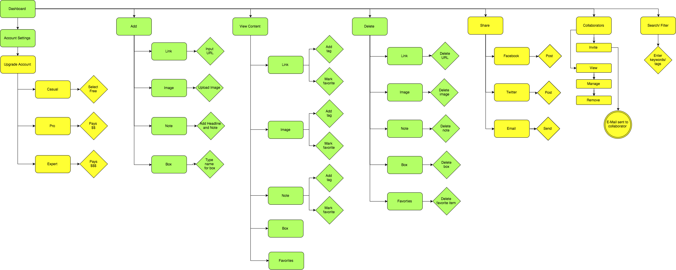
Open Draw.io for User Flows in another tabopen_in_new
Low-Fidelity Wireframes
I created low-fidelity wireframes through Balsamiq.com to focus on the functionality of the web app.
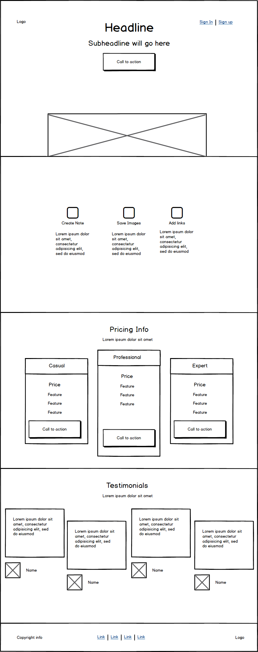
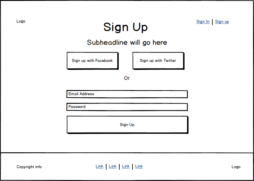
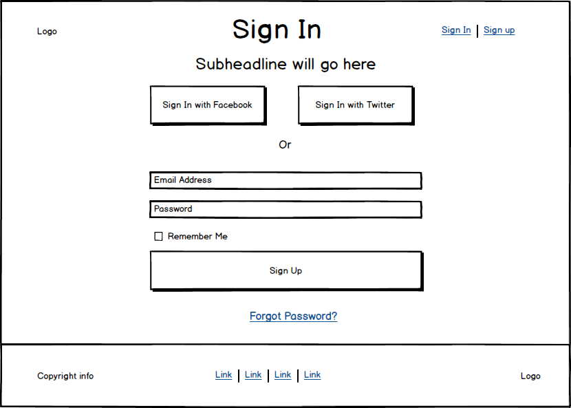
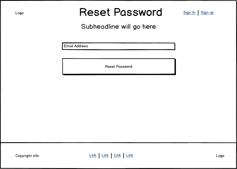
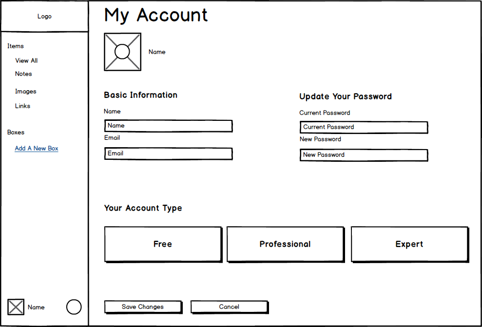
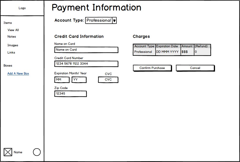
I describe how I tested wireframes to solve for some of the user stories under the Testing section.
Visual Design
To create a brand name and logo design, I looked to well-known brands that I admire, such as Uniqlo, for inspiration. The common pattern that I saw with popular brands is that they use carefully selected typography and simple logos. The logos also scale well to smaller sizes but are still recognizable.
I went through some ideas for a brand name and logo.
I eventually settled on the name Kollect. I needed to be straight forward in communicating what people can do with the web application, which is to collect things. I carried the collection theme into designing the logo. I grouped small triangles using gestalt-ism to form a simple, clean, modern box that scales well to smaller sizes.
Typography
I used PT Serif for the body text and complemented it with Karla, a san serif typeface similar in structure to PT Serif, but with a softer style meant to draw the eyes to headers and buttons.
Style Guide
Lastly, I worked on color to finalize the style guide. I chose a light blue to give the app a light, fresh feel. I used the Adobe's Color Wheel to build a monochromatic palette.
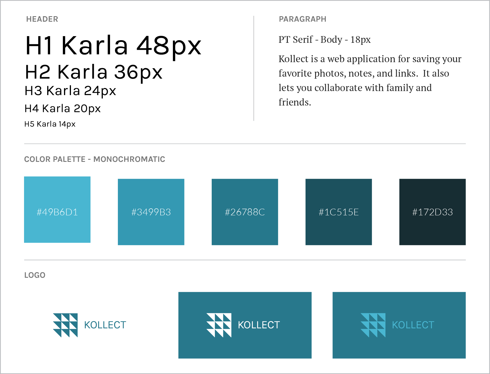
Open Style Guide in another tabopen_in_new
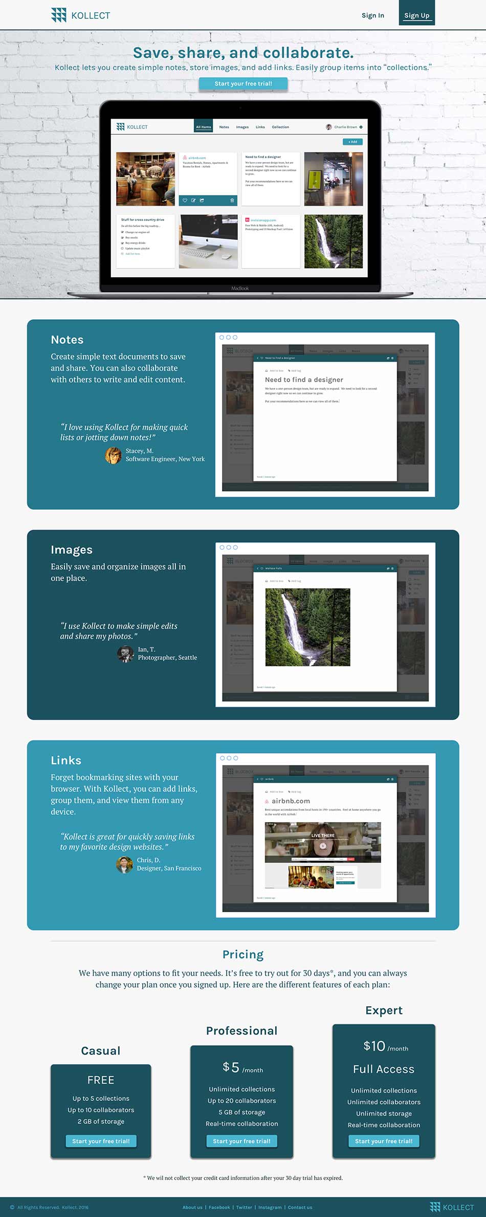
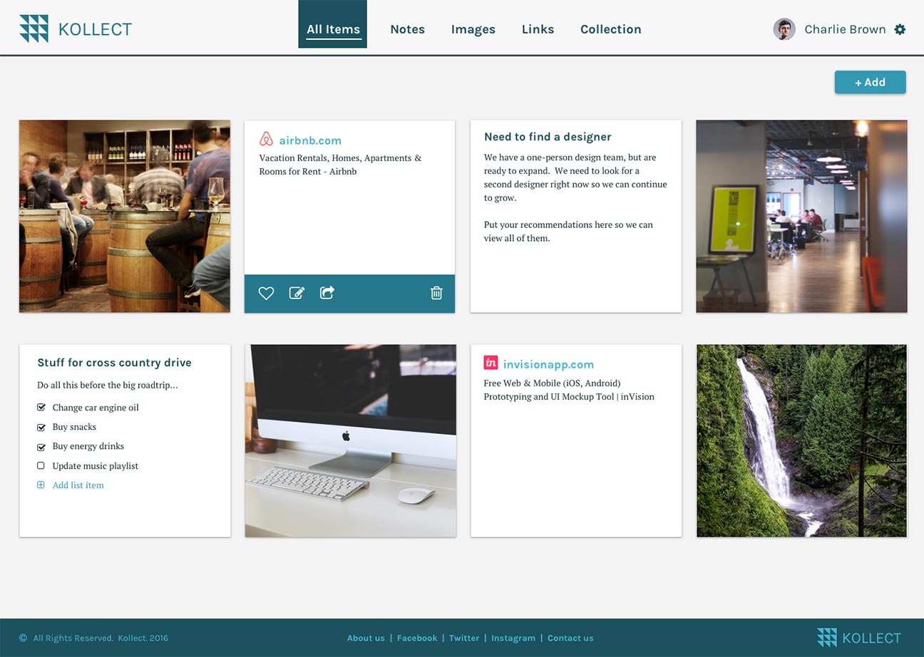
Mockups
With the style guide, I used Sketch app to create high fidelity mockups to give the design a realistic look and feel. I also used color contrast to reinforce the visual hierarchy on each page.
Homepage
Testing
I tested often during every stage of the design process from low-fidelity wireframes to high-fidelity mockups and prototype.
Low-Fidelity Tests
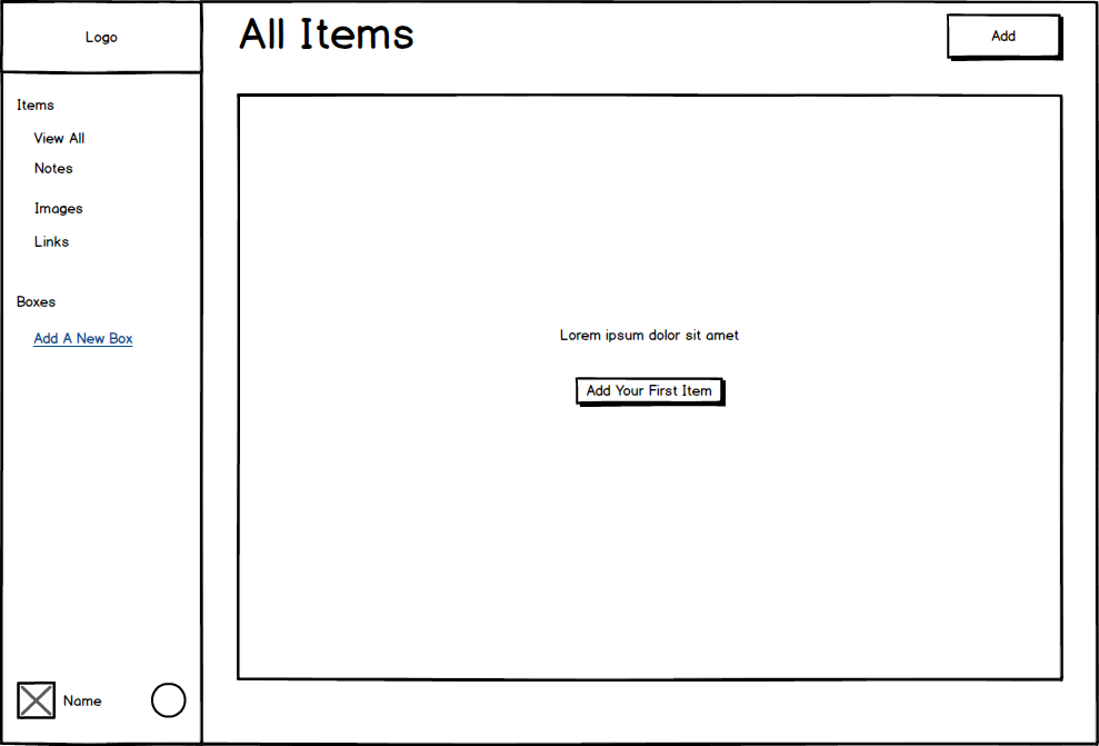
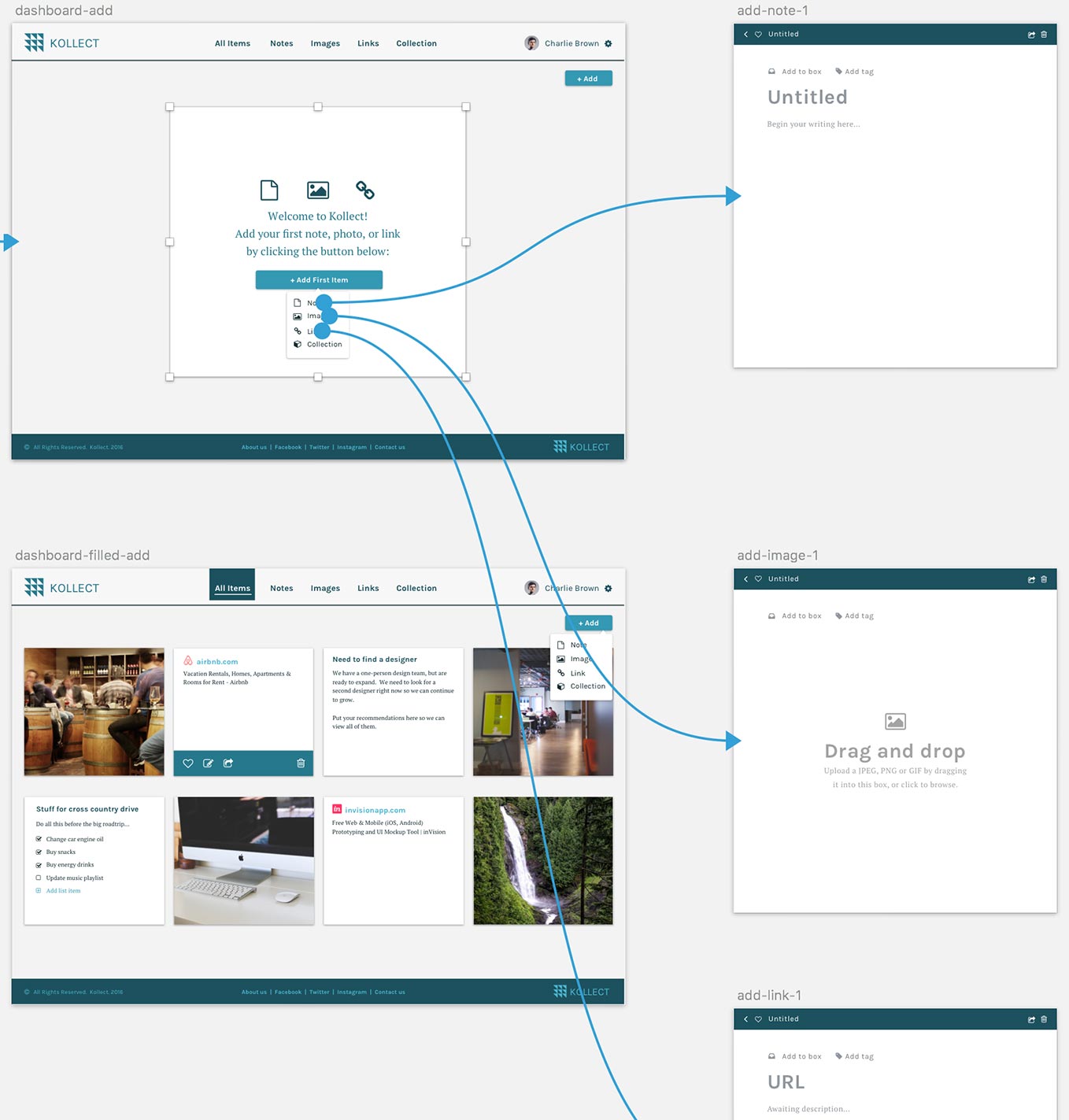
I conducted four usability tests using wireframes. I used a combination of in-person and remote testing with family, friends, and strangers to solve for the various user stories.
For example, using the dashboard wireframe, I asked testers to add a note, image, or link.
Results from people attempting to add items:
- All were distracted by the unfinished wireframe items on the dashboard.
- One person was confused about the purpose of the left side menu bar and attempted to add an item by clicking there.
- All testers eventually found the "Add" button in the top right corner. Some were faster than others.
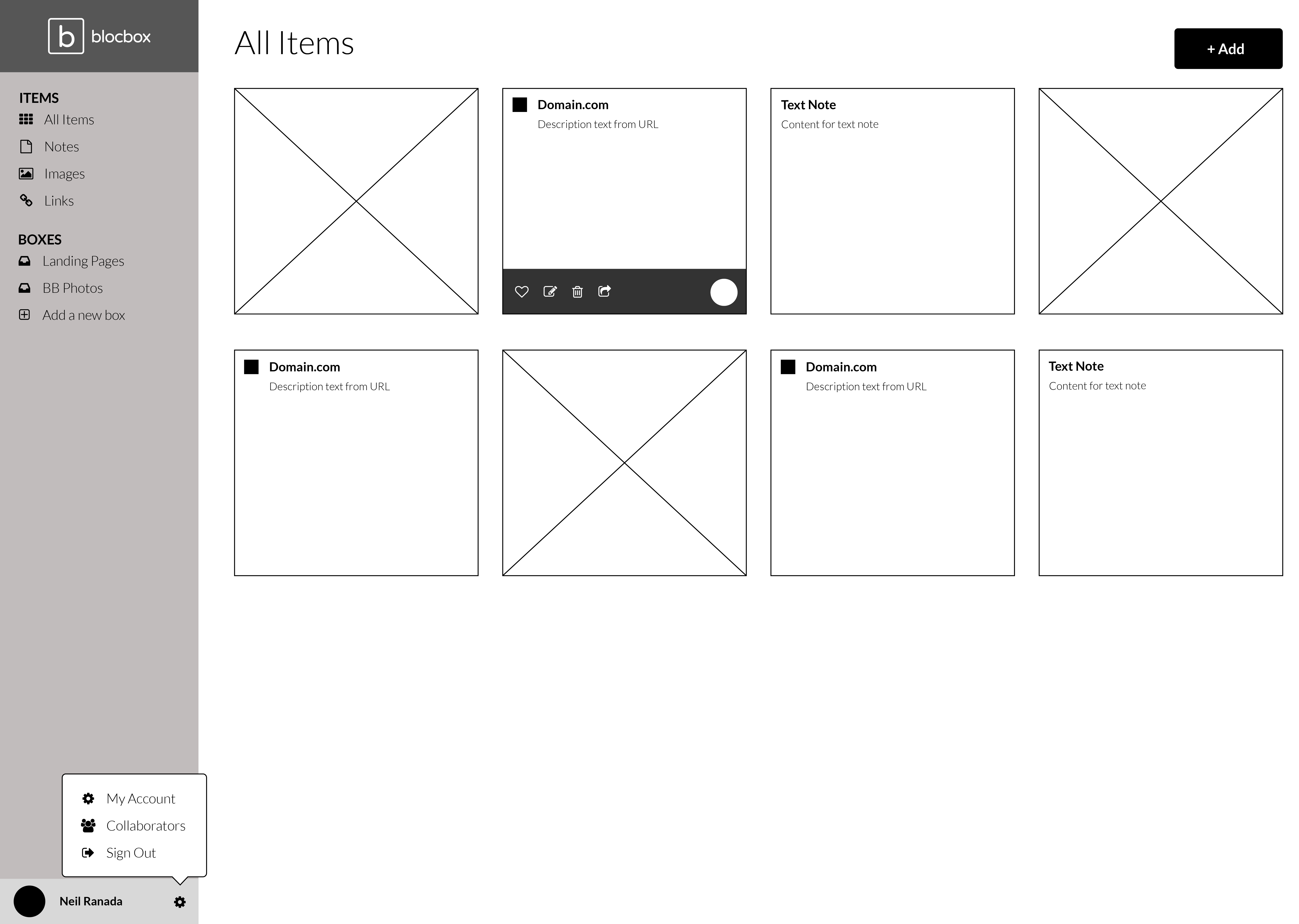
Based on these observations, I removed the vertical side bar because it was too distracting. I also relocated the navigation links to the top horizontal menu bar. It was also clear that I needed higher fidelity wireframes and mockups to give people more context.
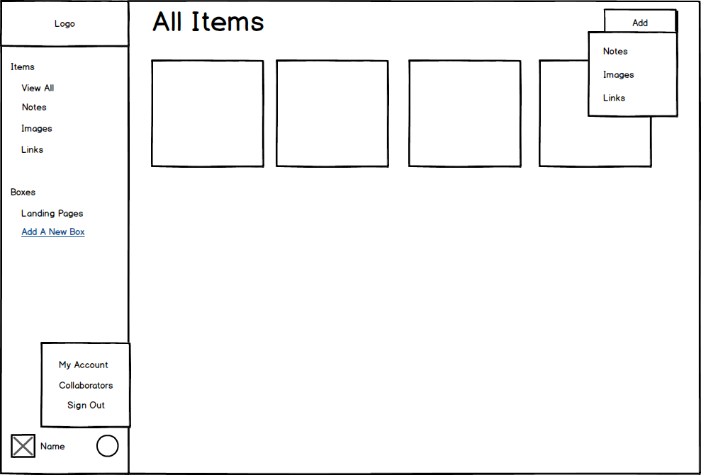
Using the same dashboard wireframe above, when testers were asked to go to account settings and upgrade to a professional account:
- All users struggled to find the avatar and gear symbol in the button left-hand corner.
- Most users did not scroll down to find it.
As a result, the settings link was relocated to the top right corner of the main menu for more visibility.
Here are changes applied from the lessons learned above to a higher fidelity version of the dashboard:
Usability Testing
I conducted three usability tests. I used a high-fidelity prototype created with Sketch and InVision. I then posted it on UserTesting.com.
I came up with three test objectives:
- Do people understand the services and features of Kollect?
- Can they easily sign up and add content?
- Do they feel that they can add and organize content?
I gave testers the tasks below and the following scenario:
"Imagine you are looking for a new app to organize your notes, images, and links."
Tasks:
- Look around the homepage and talk about what you think this is about. What can you do here, what's it for, what strikes you about it?
- Sign up for a free trial and add your first item. (your real information is not required) Was it easy to add an item?
- Go back to the dashboard. How do you feel about the app as a tool for collecting and organizing notes, images, and links?
Usability Test #1 Results
- Understood that the web application was used for content management
- Was unsure of what the "boxes" meant in the price description section of the homepage. However, she correctly assessed it as a way to collect items.
- Easily added an item, however, was unable to navigate back to the dashboard. The top portion of the modal was hidden, and she was not able to scroll to see the navigation options. Eventually, she clicked outside of the modal to exit.
Press play above or watch video in another tabopen_in_new
Usability Test #2 Results
- "This is called 'Kollect' so obviously I'm going to collect things."
- While viewing the homepage: “It looks like it would be very simple.”
- Easily added a link.
- Exited the modal by clicking outside the modal and returned to the blank dashboard.
Press play above or watch video in another tabopen_in_new
Usability Test #3 Results
- Impression on the homepage: "My first thought is that this sounds like Pinterest. Although, you don't really store notes in Pinterest. You store more links with pictures."
- Also, exited the modal by clicking outside the modal and returned to the blank dashboard.
- Easily added items. Was very exploratory and successfully tried adding notes, images, and links.
- On attempting to add a collection: "I'm assuming it's going to let me put links, images, and notes all in one place."
Press play above or watch video in another tabopen_in_new
Going back to answering the test objectives:
- Do people understand the services and features of Kollect?
Yes, all testers recognized it as some tool for collecting notes, images, and links. - Can they easily sign up and add content?
Yes, all testers were able to add items. - Do they feel that they can add and organize content?
In general, the testers were able to add content. All testers correctly attempted to exit the modals by clicking outside, as expected. However, as a limitation of the overlay feature with InVision, testers returned to the blank dashboard which is where the modal overlays started. All testers, however, talked about how they might use the dashboard for organizing content.
Prototype
Open Prototype and try out the usability tasks in the section above.open_in_new
I used InVision to create a prototype with mockups imported from Sketch app. You can open it in another tab and try the scenario and tasks found in the Usability Testing section above.
Conclusion
I was able to design a web application where people can easily sign up and add content.
It was pleasing to see how people during usability tests clicked outside of the modals to exit them. Unfortunately, they returned to the blank dashboard which is a limitation of the overlay feature in InVision. The "Back" button would have led them to the filled dashboard, but none of the testers used this option.
If I were to test that interaction pattern again, I would create mockups mimicking a modal overlay and set up touch zones around the box so that testers can transition to the filled version of the dashboard.
If given more time, I would have liked the opportunity to collaborate with other people that specialize in business, design, and development. Although I created a simple design that works, there are many perspectives from other areas of expertise that should be incorporated to build more value into Kollect.
Designing Kollect was enjoyable, and I hope to build more things that people find useful in the future.